Modern Website Design Features Fitness Studios Need to Double Conversions
So, your fitness studio is buzzing with energy in person with playlists, people, and post-workout glow, but online? Crickets. If your website feels more like a static brochure than your best sales tool, we need to talk about modern website design. Because here’s the thing, friend, your dream clients are out there but they’re scrolling fast and making snap decisions. If your site doesn’t grab their attention and guide them to book, you’re losing them.
Lucky for you, a few strategic (and stylish) tweaks can completely shift the game. Whether you're opening your doors for the first time or giving your digital presence a much-needed overhaul, these features are going to help you build a user friendly website that does the heavy lifting for you (as usual, pun absolutely intended).
Let’s dig into what sets the best fitness websites apart and how you can make sure yours is one of them!
Start with a Clean, Modern Layout That’s Easy to Navigate
Your design should work as hard as you do
At its core, modern website design is all about clarity, simplicity, and a little bit (or a lot, we don’t judge) of wow factor. That means no cluttered pages, no overwhelming walls of text, and no mystery navigation.
Your fitness website needs to make it super simple for people to find what they’re looking for. Which means things like class schedules, sign-up options, trainer info, pricing, and FAQs that are all easy to access from your homepage or main menu. We love a sticky navigation bar that stays visible as users scroll that ensures your most important actions are always within reach.
Include a Visual Class Schedule That’s Mobile-Friendly

Don’t make people hunt for your calendar
One of the most important elements of fitness website design is an easy-to-read, interactive class schedule. People want to know what you offer, when, and how they can get in.
Display your class schedule on its own dedicated page and consider a preview on the homepage. Make sure the layout is simple and optimized for mobile use. Most users are checking this information on their phones between meetings or during a quick scroll at lunch.
A modern, mobile-responsive schedule with filters by class type, instructor, or time of day makes a great first impression and gets people one step closer to booking.
Streamline the Booking and Membership Sign-Up Process
This is where your conversion rate really lives
Once someone decides to try your studio, the last thing you want is to lose them in a clunky booking process. No one wants to go through a five-step checkout process just to try a free trial, so a seamless, user-friendly sign-up experience is one of the most essential pieces of a high-converting website.
Here’s what that looks like:
Prominent “Book Now” or “Join Today” buttons on every page
A short and simple sign-up form
Transparent pricing with no hidden fees
Integration with booking software or CRMs for easy management
Reducing friction at this stage is key to increasing your website conversion rate. If it feels easy, people are more likely to follow through.
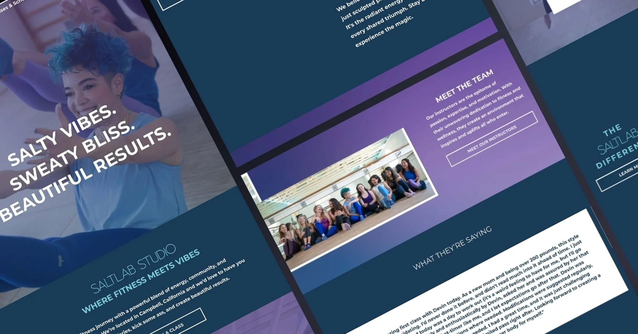
Feature Testimonials Where It Counts

Let your clients do the talking
We know social proof works (and sells) and your website should use it to your advantage. The best fitness websites incorporate real testimonials from current members to help build trust.
Add short, impactful quotes or video clips to your homepage, membership page, and even next to your class schedule. Seeing positive feedback in the right places can help tip the scales for someone who’s still deciding whether or not to book. It’s one of the simplest, most impactful features in modern website design, especially when it comes to building credibility and driving conversions.
Need inspiration? A “Why Our Members Love Us” section with rotating reviews works beautifully, especially if you include headshots or first names to make the testimonials feel personal and authentic.
Engaging Trainer Bios That Do More Than Flex
People want to know who will be making them sweat
Your team is part of your brand! The instructors featured on your site should feel approachable, qualified, and relatable. Too often, trainer bios are dry or buried under layers of navigation.
Instead, showcase your trainers with bios that highlight their specialties, teaching styles, and personalities. Don’t just list certifications, but share fun facts, their favorite class formats, or what motivates them to teach.
This builds a sense of connection and makes your site feel more human-centered, which is a key trait of cool websites that people actually want to revisit.
Make Sure Your Site Is Fully Mobile Responsive
Because your audience is always on the move
Most people looking for a new fitness studio are searching on their phones in the carpool line or mid-coffee scroll, not desktops. So, if your site isn’t mobile-responsive, it’s losing you money.
A strong modern website design should load quickly, look great, and work flawlessly on every screen size. That includes easy-to-click buttons, readable fonts, and layouts that adjust automatically for mobile users.
Not sure if your site passes the mobile test? Try navigating your own site from your phone. If you’re pinching, zooming, or getting frustrated, your users probably are too. But when your site works beautifully on any device, you boost both credibility and your website conversion rate. Win-win.
Include Clear CTAs That Guide Visitors to Action
Don’t leave them wondering what to do next
A conversion-focused site should lead people naturally from curiosity to commitment. To do that, your calls to action (CTAs) need to be front and center.
Some examples of high-converting CTAs:
“Try Your First Class Free”
“See Our Schedule”
“Become a Member Today”
“Meet Your Trainers”
Place them throughout the site, not just on the homepage. Repetition helps, especially if you’re offering a compelling promotion or free trial. Just make sure each CTA is tied to a clear benefit so users understand exactly what they’re getting.
Highlight Your Differentiators Loud and Clear

Tell them why you’re different
Every fitness studio has something that makes it unique! Whether it’s your approach to coaching, your vibe, your location, or your community, your website should communicate that clearly within the first few scrolls.
This doesn’t need to be a long paragraph, just highlight what you do best. One bold headline and a few bullet points can do the job perfectly. The goal is to give people a reason to choose you over the studio down the street.
Consider Visual Design and Branding Details
Looks aren’t everything, but they matter a lot
Last and not at all least, let’s talk aesthetics. How your site looks plays a major role in how users perceive your business. People make snap judgments, and if your site feels outdated or off-brand, they might bounce before reading a single word.
The best fitness websites combine modern visuals, intuitive layouts, and strong branding. This can include:
A custom color palette that reflects your energy
Clean, readable fonts
High-quality photos of real classes and instructors
Minimalist design that lets content breathe
Your website should reflect the thriving, modern studio you’ve built because when it looks the part, people will trust that it delivers.
Build a Fitness Website That Converts Like Crazy
When it comes to modern website design, it’s not just about having a pretty site, it’s about having one that works. Your website should be helping you fill classes, grow your membership, and build community before anyone even walks through your door.
At Bell & Whistle Design Studio, we specialize in building modern websites that are just as hardworking and dynamic as the businesses behind them. We help fitness studios like yours create clean, conversion-focused sites that reflect your brand, attract new members, and make running your business easier.
If your current website isn’t cutting it, we’d love to help. No pressure, just smart strategy and beautiful design that gets results. Reach out today let’s get your website in peak condition!
